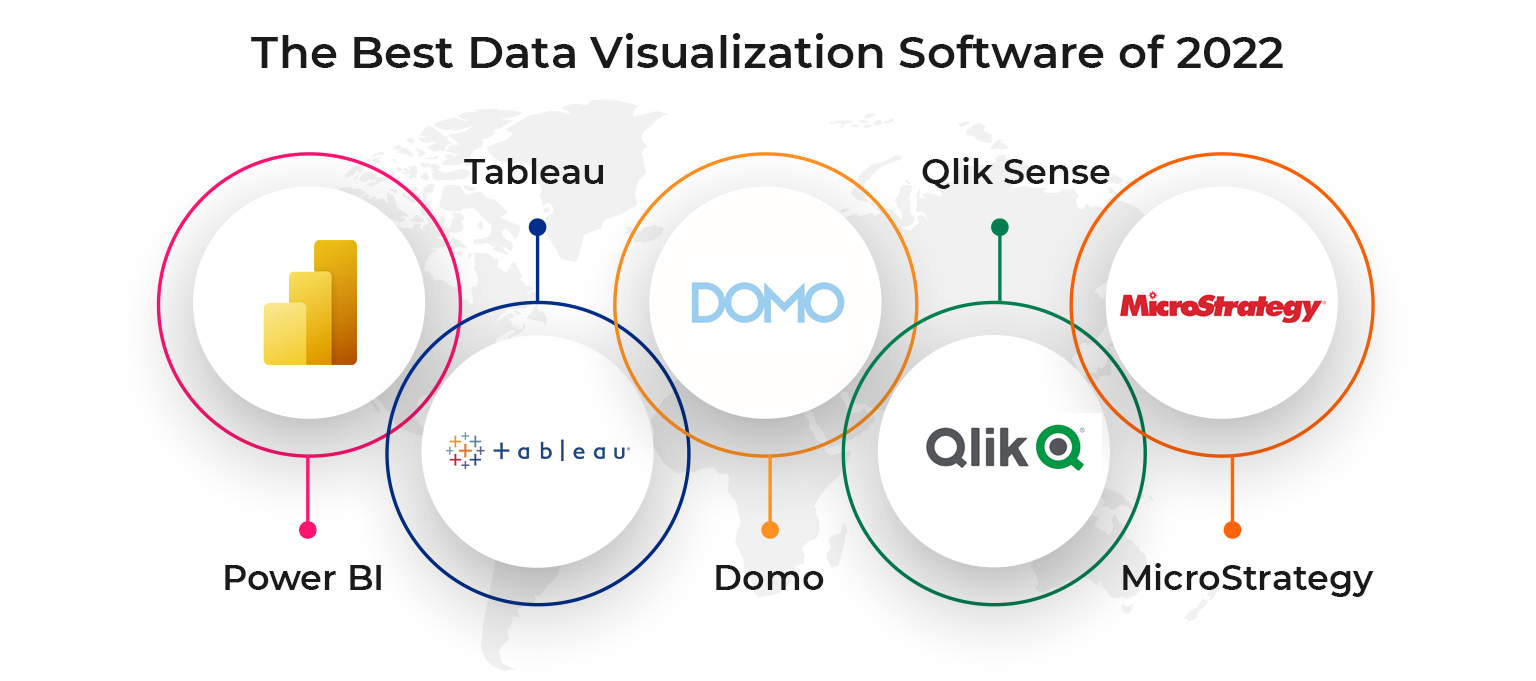
Top 5 Visualization Tools to Transform Your Data Presentation
In today's data-driven world, presenting information in a clear and visually appealing way is crucial for effective communication. Whether you're a business analyst, a marketer, or a researcher, utilizing visualization tools can significantly enhance your ability to convey complex data. Here are the Top 5 Visualization Tools that can help you transform your data presentation:
- Tableau - Known for its powerful capabilities, Tableau allows users to create interactive visualizations and dashboards that can handle large data sets with ease.
- Power BI - Part of the Microsoft suite, Power BI integrates seamlessly with other Microsoft products and offers intuitive tools for data analysis and visualization.
- Google Data Studio - A free tool that offers extensive customization options, Google Data Studio is perfect for creating dynamic reports and visualizations from various data sources.
- Infogram - This user-friendly platform specializes in designing infographics and presentations, making it ideal for marketers and content creators.
- D3.js - For those looking for more advanced customization, D3.js is a JavaScript library that enables the creation of complex and interactive data visualizations online.
How to Choose the Right Visualization Tool for Your Data Needs
Choosing the right visualization tool for your data needs is a crucial step in effectively communicating your insights. To begin with, assess the type of data you are working with. Different tools specialize in various data formats, whether they are categorical, numerical, or time-series. For instance, if you are primarily working with complex datasets requiring detailed analyses, tools like Tableau or Power BI may be your best options. On the other hand, if you need to create interactive dashboards for real-time data monitoring, consider options like Google Data Studio or D3.js.
Another important factor to consider is the user experience each tool offers. Check whether the tool has a steep learning curve or if it's designed with user-friendliness in mind. Tools that provide pre-built templates and drag-and-drop functionalities can significantly reduce the time to insight. Additionally, take into account the collaboration features available. A good visualization tool should not only allow you to create impactful visuals but also enable easy sharing and collaboration with stakeholders. By weighing these considerations, you can confidently select a visualization tool that aligns with your data goals.
The Impact of Data Visualization on Decision Making: Why It Matters
Data visualization has emerged as a pivotal tool in enhancing decision-making processes across various industries. By transforming complex datasets into intuitive visual formats such as charts, graphs, and maps, organizations can quickly glean insights that would otherwise remain obscured in raw numbers. The ability to identify trends, patterns, and correlations enables decision-makers to act swiftly and strategically, reducing the risk of error that often accompanies data interpretation. Consequently, the impact of data visualization transcends mere aesthetics; it fundamentally changes the way information is processed and understood.
Moreover, effective data visualization fosters improved communication within teams and stakeholders, ensuring that all members are on the same page regarding key metrics and outcomes. By providing a common visual language, it breaks down barriers and enhances collaborative efforts. When data is presented clearly, it empowers teams to discuss findings confidently and make informed choices that align with organizational goals. Ultimately, recognizing why data visualization matters is crucial in today’s data-driven landscape, as it drives efficiency and supports a culture of evidence-based decision-making.